Logo
The PV mark is two letters built from the same parts: thick stems, 45° chamfers and soft corners. The narrow slot in the P reads like a visor, a quiet nod to agents that watch and act. Always use the master files; never redraw or retype the mark.
The mark
The mark works on its own and is the default in most places: headers, app icons, social avatars, documents.
Lockups
Where people may not know us yet, pair the mark with the descriptor. In English it reads “AI Developing”, in Arabic “لتطوير الذكاء الاصطناعي”, set in JetBrains Mono and Vazirmatn. The mark always comes first in the reading direction.
Colourways
The mark is one solid colour: white on black, or ink on white. On the brand pink, use black. Nothing else.
Clear space
Keep a clear space of x on every side, where x is the width of the V’s left stem (about a third of the mark’s height). Nothing else goes in this space: no text, no edges, no other logos.
Minimum size
On screens, the mark is at least 14 px tall; in print, at least 5 mm. Below that the slot closes up. The app icon has its own small-size version.
App icon
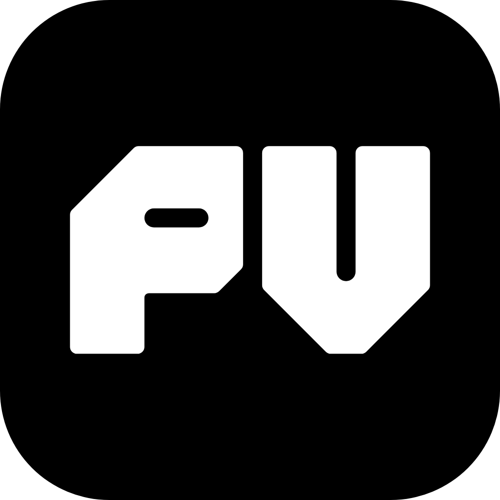
For app icons and favicons, the white mark sits on a PV Black rounded square, scaled to leave the clear space.
Don’t
Stretch or squash it
Rotate or tilt it
Fill it with a gradient
The colour sweep is only for motion.
Outline it
Add shadows or effects
Recolour it
Only black, white, or black on pink.
Place it on busy images
Crowd it
Keep the clear space.
© 2026 Primitive Vision AI Developing Services